2022. 9. 25. 00:07ㆍ배울수록 연봉은 늘어간다./자바스크립트
※ 목차
- 선택자 Selector에 대해서 알아봅시다.
- css의 기본 단위는?
- css의 색상은?
- 선택자(Selector)의 종류
- box 모델
- text 관련 스타일
- 위치정렬
- flexbox
1. 선택자 Selector에 대해서 알아봅시다.
CSS는?
웹에 적용할 스타일을 적어둔 일종의 스타일 명세서입니다.
명세서를 CSS로 표현해 봅시다.

Selector : 스타일을 적용하고자 하는 html에 적용
Property: 스타일 속성 이름
Value : 속성에 대응되는 값
{ } : 대괄호는 선언블록 이라고 합니다.
; : 세미콜론은 다른 선언과 구분을 합니다. Property:Value; 이 문장을 합쳐서 선언했다고 표현합니다.
영어로 표현!
Selector {
Property:Value;
}
한글로 표현!
선택자 {
속성 : 값;
}
예제▼
| h1 { color: red; } p { color: red; } |
실행화면▼
 |
- 위 예제와 같이 중복으로 코드를 작성하는 것은 자원 낭비입니다.
예제▼
| h1, p { color: red; } |
- , : 콤마를 이용하면 코드를 간단하게 작성할 수 있습니다.
- 실행을 해보면 결과물은 같은 것을 확인할 수 있습니다.
예제▼
| h1, p { color: red; } h1 { background: blue; } p { background: green; } |
- background 색상을 다르게 주어서 표현했습니다.
실행화면▼
 |
2. css의 기본 단위는?
css의 값(value)은 크기도 바꿀 수 있습니다.
- 고정 크기
- 가변 크기
1. 고정크기
| 단위 | 설명 |
| px (pixel) | 픽셀 (화소) |
| pt | 포인트 |
| in | 인치 |
| cm,mm | 센티미터,밀리미터 |
우리가 알고 있는 모니터의 크기로 픽셀로 나눈다면?
- 1920x1080는 픽셀의 수를 나타 냅니다.
- 1920x1080=2.073.600px
| html 예제 | css 예제 |
| <div id="main"> 단위 <div id="px">px</div> <div id="em">em</div> <div id="rem">rem</div> </div> |
#main { background-color:bisque; font-size: 24px; height: 240px; } |
html
- <div> : 1주차 html 기초에서는 간단히 넘어갔는데 css에서는 세부적으로 다루어 보겠습니다.
- id : 간단히 설명하면 이름이라 생각합니다. id의 이름은 main으로 만들었습니다.
css
- #아이디{ 속성1:속성값; 속성2:속성값; }
- id에 줄 경우 아래처럼 #을 맨 앞에 붙여 사용하며, 원칙적으로 하나의 객체에만 적용할 수 있습니다
실행화면▼
 |
2. 가변크기
| 단위 | 설명 |
| em | 최상위 요소(html태그)에서 지정하는 font-size 값 ex)현재 요소의 font-size 값이 이 16px 라면 2em 은 32px 을 의미합니다 중요한 것은 항상 16px이 되는 것은 아닙니다. 브라우저에서 설정이 가능합니다. |
| % | 백분율 단위 이미지나 레이아웃의 너비나 높이를 지정할때 쓰입니다. ex)상위 font-size 값이 18px이고 해당 요소의 font-size 값이 50%면 해당 요소의 font-size는 9px이 됩니다. |
| rem | 현재 스타일에서 지정하는 font-size 값 ex) html 태그의 font-size 값이 이 16px 라면 2rem 은 32px 을 의미합니다 |
| vw | 화면비 백분율 단위 |
| vh | 화면비 백분율 단위 |
| vmax | 화면비 최대값 |
| ex | 현재 폰트의 x-height 값 |
=> 여기서 짚고 넘어가야 될 부분은 em과 rem의 차이를 확인하셔야 합니다.
우리는 대부분 스마트폰을 사용해서 문자를 보지만 때론 pc로 보거나 태블릿을 이용해 보기도 하는데
이러한 차이는 요즘 말하는 반응형 웹을 만들기 위해서는 매우 중요한 요소로 보기 때문에
생각으로는 화면의 크기에 따라 반응하는 em이 맞겠지만 권장 사양은 rem으로 사용하는 것을
추천합니다. 왜 그런지에 대해서는 나중에 하나씩 배우면서 알아보도록 하겠습니다.
3. css의 색상은?
- 키워드
- hex code
- rgb
1. 키워드
- 가장 간단합니다.
- 140가지 색상을 지원합니다.
- 컬러 네임을 참고하세요.
https://www.w3schools.com/colors/colors_names.asp
HTML Color Names
W3Schools offers free online tutorials, references and exercises in all the major languages of the web. Covering popular subjects like HTML, CSS, JavaScript, Python, SQL, Java, and many, many more.
www.w3schools.com
css 예제▼
| .box { width: 200px; height: 100px; background-color: blue; } |
2.RGB
- 빛의 3원 색인 빨강, 초록, 파란색을 혼합하여 색을 표현합니다.
- RGB 값은 0~255의 값으로 나타냅니다.
- RGB 색상표를 참고하세요.
http://www.n2n.pe.kr/lev-1/color.htm
256 color 색상표
FFFFCC R - 255 G - 255 B - 204
www.n2n.pe.kr
CSS 예제▼
| .box { width: 200px; height: 100px; background-color: rgb(102, 205,170) } |
3.HEX Code
- HEX 값은 16진수 6자리 코드로 색상을 표현합니다.
- 6자리 코드는 2자리씩 빨강 , 녹색 , 파랑에 대한 값을 표현합니다.
- HEX Code 표를 참고하세요.
HTML Color Codes
Easily find HTML color codes for your website using our color picker, color chart and HTML color names with Hex color codes, RGB and HSL values.
htmlcolorcodes.com
CSS 예제▼
| .box { width: 200px; height: 100px; background-color: #F08080; } |
투명도를 결정하는 Alpha
RGB
 |
예제▼
| .box { width: 200px; height: 100px; background-color: rgba(102, 205, 170, 0.5); } |
HEX Code
 |
예제▼
| .box { width: 200px; height: 100px; background-color: #F0808055; } |
4. 선택자(Selector)의 종류
- 단순 선택자
- 타입 선택자 (Type)
- 아이디 선택자(Id)
- 클래스 선택자(Class)
- 전체 선택자(Universal)
- 속성 선택자(Attribute)
2. 복합 선택자
3. 가상 클래스 선택자
타입 선택자 (Type)
해당 태그를 가지는 모든 요소에 스타일을 적용합니다.
예제▼
| html | css |
| <h1>저는 h1 태그 입니다.</h1> <p>저는 p 태그 입니다.</p> <h3>저는 h3 태그 입니다.</h3> <p>저는 p 태그 입니다.</p> |
p { color: red; } |
=> p 태그만 글자의 색이 바뀝니다.
실행화면▼
 |
아이디 선택자(Id)
- 아이디 이름으로 스타일을 적용합니다.
- 우리가 알고 있는 통상적인 id가 맞으며 identification의 약자입니다.
- 단 하나의 나 밖에 존재하지 않습니다.
- 서로 다른 요소들을 구별하기 위한 장치로 쓰입니다.
예제▼
| html | css |
| <h1>저는 h1 태그 입니다.</h1> <p>저는 p 태그 입니다.</p> <h3>저는 h3 태그 입니다.</h3> <p id="goorm">저는 p 태그 입니다.</p> |
#goorm { background-color: blue; } |
실행화면▼
 |
=> 타입 선택자와 id 선택자를 합쳐봅시다.
css 예제▼
| p { color: red; } #goorm { background-color: blue; } |
실행화면▼
 |
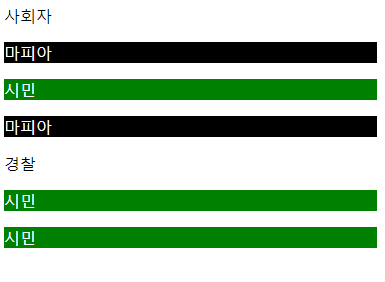
클래스 선택자(Class)
- 하나의 반처럼 비슷한 특징을 갖는 요소를 묶어 그룹으로 만들 수 있습니다.
- .(콤마)로 지정해 줍니다.
예제▼
| html | css |
| <p>사회자</p> <p class="mafia">마피아</p> <p class="citizen">시민</p> <p class="mafia">마피아</p> <p>경찰</p> <p class="citizen">시민</p> <p class="citizen">시민</p> |
.mafia { color: white; background-color: black; } .citizen { color: white; background-color: green; } |
실행화면▼
 |
전체 선택자(Universal)
- 모든 요소에 스타일을 적용합니다.
- 속도 저하 때문에 쓰지 않기를 권장합니다.
- *(별)로 지정을 합니다.
css 예제▼
| * { color: blue; } |
실행화면▼
 |
속성 선택자(Attribute)
- 특정 HTML 속성을 가지고 있는 모든 요소에 스타일을 적용합니다.
- css에 선택자[속성명="속성값"] { color:red; }
- [ ] (대괄호)로 속성과 속성 값을 넣어 작성합니다.
예제▼
| html | css |
| <a href="https://edu.goorm.io/" target="_self">구름EDU 현재 창</a> <a href="https://edu.goorm.io/" target="_blank">구름EDU 새 창</a> <a href="https://ide.goorm.io/" target="_self">구름IDE 현재 창</a> <a href="https://ide.goorm.io/" target="_blank">구름IDE 새 창</a> |
a[target="_blank"] { color: red; } |
- 같은 페이지의 링크지만 새창에서 여는 태그만 글자색을 빨강으로 바꾸어 주려고 합니다.
- self , blank는 1차시에 HTML에서 배웠으니 참고해 주세요!
실행화면▼
 |
Class를 이용한 코드 예제▼
| html | css |
| <a class="link" href="https://edu.goorm.io/" target="_self">구름EDU 현재 창</a> <a class="link" href="https://edu.goorm.io/" target="_blank">구름EDU 새 창</a> <a class="link" href="https://ide.goorm.io/" target="_self">구름IDE 현재 창</a> <a class="link" href="https://ide.goorm.io/" target="_blank">구름IDE 새 창</a> |
.link[target="_blank"] { color: red; } |
=> 실행을 해보면 코드에서 변화가 있지만 위에 했던 결과값과 같습니다.
1. 단순 선택자
2. 복합 선택자
- 자식 선택자
- 후손 선택자
3. 가상 클래스 선택자
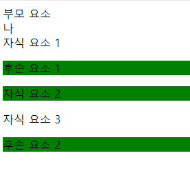
부모(parent) , 자식(child) , 후손(descendant)
html 예제▼
 |

- 부모 (article) , 너(div) , 자식(p)이라는 연결관계를 가지는 요소들이 존재한다고 가정을 합니다.
- div를 기준으로 div 안에 포함되는 하위 요소인 p는 자식 요소에 해당되고 div 상위 요소인 article은 div의 부모 요소입니다.
- 부모 자식 관계는 상대적입니다.
- 공백의 위치를 잘 보세요!! 중요합니다~
- 자식 요소와 그 아래 포함된 모든 태그들을 후손 요소라고 부릅니다.
- 자식과 후손 이 두 가지가 복합 선택자의 대표적인 예입니다.
자식(child) 선택자
- 선택자 A의 모든 자식 중 선택자 B와 일치하는 요소를 선택합니다.
- >(꺽쇠)를 사용합니다.
- CSS : 선택자 A > 선택자 B { color :green; }
예제▼
| html | css |
| <article> 부모 요소 <div id="me"> 나 <div>자식 요소 1 <p>후손 요소 1</p> </div> <p>자식 요소 2</p> <div>자식 요소 3 <p>후손 요소 2</p> </div> </div> </article> |
#me > p { background-color: green; } |
- 위 예제는 me의 자식 중 p를 찾아라 라는 뜻입니다.
실행화면▼
 |
css예제▼
| div > p { background-color: green; } |
- 위 예제는 div의 자식 중 p를 찾아라는 뜻입니다.
- 조금 헷갈릴 수도 있는데 그림을 그리면 이해가 쉽습니다.
- 모든 div의 자식을 찾는 거기 때문에 상대적이라고 말할 수 있습니다.

실행화면▼
 |
후손(descendant) 선택자
- 선택자 A의 모든 후손 중 선택자 B와 일치하는 요소를 선택합니다.
- 중간에 띄어쓰기를 사용합니다.
- CSS : 선택자 A 선택자 B { color :green; }
예제▼
| html | css |
| <article> 부모 요소 <div id="me"> 나 <div>자식 요소 1 <p>후손 요소 1</p> </div> <p>자식 요소 2</p> <div>자식 요소 3 <p>후손 요소 2</p> </div> </div> </article> |
#me p { background-color: yellow; } |
- 위 예제는 me의 후손 중 p를 찾아라 라는 뜻입니다.
- 단순하게 예제만 본다면 후손 요소 두 개만 색상이 변하는 게 맞지만 상대적인 거라서 자식 요소 2번도 색상이 바뀌는 것을 확인할 수 있습니다.
- 그림을 보면 이해가 쉽습니다.

실행화면▼
 |
1. 단순 선택자
2. 복합 선택자
3. 가상 클래스 선택자
가상(pseudo) 클래스 선택자
- 직접 정의할 수 없고 실제 html에 보이지 않습니다.
- 실제가 아닌 가상이라는 점
- 선택자에 가상 클래스를 붙여 이용합니다.
- css : 선택자:pseudo-class{ color:red;}
| 가상 클래스 종류 | 특징 |
| a:link | 방문하지 않은 링크일 때 |
| a:visited | 방문한 링크일 때 |
| a:hover | 링크에 마우스를 올렸을 때 |
| a:active | 선택된 링크일 때 (마우스 오른쪽 버튼을 누르면 색상이 변합니다.) |
예제▼
| html | css |
| <a href="https://edu.goorm.io" target="_blank">구름EDU</a> | /* 방문하지 않은 링크일 때 */ a:link { color: turquoise; } /* 방문한 링크일 때 */ a:visited { color: green; } /* 링크에 마우스를 올렸을 때 */ a:hover { background-color: yellow; } /* 선택된 링크일 때 */ a:active { background-color: blue; } |
- 직접 실행을 해서 눈으로 변화는 것을 확인해 봅니다.
5. box 모델
- html의 모든 요소는 박스의 형태를 갖습니다.

- 박스의 모델은 내용(content) , 패딩(padding) , 경계선(boder) , 마진(margin)으로 이루어져 있습니다.
- 내용 : 태그 사이에 실제로 담고 있는 부분
- 패딩 : 내용과 경계선 사이에 있는 여백
- 경계선 : 내용을 감싸고 있는 테두리
- 마진 : 경계선 밖

내용(content)
- 예제를 통해 콘텐츠의 크기를 확인합니다.
- 개발자 도구를 통해 우리가 지정했던 콘텐츠의 크기를 확인합니다.
- width , height는 콘텐츠 박스의 크기를 조정합니다.
예제▼
| html | css |
| <div id="main"> <div id="inner"> 구름EDU </div> </div> |
#inner { background-color: pink; width: 200px; height: 100px; } |
실행화면▼
 |
개발자 도구▼
 |
경계선(boder)
● 세 프로퍼티를 이용합니다.
- boder-style
- boder-width
- boder-color
- boder-shortcut
- boder-radius
1.boder-style
- 선의 종류를 지정합니다.
- 가장 많이 쓰이는 것 (solid : 실선 , dashed : 파선 , dotted : 점선 , double : 이중선)
- 선의 종류를 참고해 보세요.
- 개발자 도구에서 적용 순서를 알아봅니다.
https://developer.mozilla.org/ko/docs/Web/CSS/border-style
border-style - CSS: Cascading Style Sheets | MDN
**border-style **CSS 단축 속성은 요소 테두리 네 면의 스타일을 지정합니다.
developer.mozilla.org
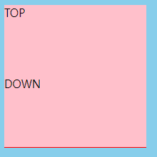
예제▼
| html | css |
| <div id="main"> <div class="inner"> TOP </div> <div class="inner" id="target"> DOWN </div> </div> |
body { background-color: skyblue; } .inner { background-color: pink; width: 200px; height: 100px; } #target { border-color: black; border-style: solid dashed dotted double; border-width: 8px; } |
실행화면▼
 |
개발자 도구▼
 |
- 적용 순서를 보면 top -> right -> bottom -> left 순으로 적용이 된 것을 확인할 수 있습니다.
2. boder-width : 선의 두께 지정
3. boder-color : 선의 컬러 지정
=>boder-style 이 없을 때는 지정되지 않습니다.
예제▼
| html | css |
| <div id="main"> <div class="inner"> TOP </div> <div class="inner" id="target"> DOWN </div> </div> |
body { background-color: skyblue; } .inner { background-color: pink; width: 200px; height: 100px; } #target { border-style: dotted; border-color: black red yellow blue; border-width: 8px 4px 16px 24px; } |
실행화면▼
 |
4.boder-shortcut
- shortcut을 이용해 한번에 지정합니다.
css 예제▼
| body { background-color: skyblue; } .inner { background-color: pink; width: 200px; height: 100px; } #target { border: red solid 1px; } |
실행화면▼
 |
- DOWN 전체 경계선이 생겨난 것을 확인합니다.
css 예제▼
| body { background-color: skyblue; } .inner { background-color: pink; width: 200px; height: 100px; } #target { border-bottom: red solid 1px; } |
실행화면▼
 |
- DOWN 하단에 경계선이 생겨난 것을 확인합니다.
5. boder-radius
- 경계선을 둥글게 만들 때 사용합니다.
- 대각선 4개의 방향으로 지정이 가능합니다.

- boder-radius 문서를 참고하세요.
border-radius - CSS: Cascading Style Sheets | MDN
The border-radius CSS property rounds the corners of an element's outer border edge. You can set a single radius to make circular corners, or two radii to make elliptical corners.
developer.mozilla.org
패딩(padding)과 마진(margin) 그리고 box-sizing
- border처럼 4방향 따로 혹은 한꺼번에 적용이 가능합니다.
- 개발자 도구를 통해 적용된 크기를 확인합니다.
예제▼
| html | css |
| <div class="box"> <div class="inner"> 구름EDU </div> </div> |
body { background: skyblue;} .inner { background: lemonchiffon; width: 100%; height: 100%; } .box { display: inline-block; background: pink; width: 100px; height: 100px; border: 8px solid red; margin: 20px; padding: 20px; } |
실행화면▼
 |
개발자 도구▼
 |
float
- 보통 이미지와 텍스트를 같이 사용할 때 쓰입니다.
- 개발자 도구를 통해 확인해 보세요
https://developer.mozilla.org/ko/docs/Web/CSS/float
float - CSS: Cascading Style Sheets | MDN
CSS 속성(property) float 은 한 요소(element)가 보통 흐름(normal flow)으로부터 빠져 텍스트 및 인라인(inline) 요소가 그 주위를 감싸는 자기 컨테이너의 좌우측을 따라 배치되어야 함을 지정합니다.
developer.mozilla.org
box-sizing
css 개념▼
.content-box {
  box-sizing: content-box;
  /* Total width: 160px + (2 * 20px) + (2 * 8px) = 216px
     Total height: 80px + (2 * 20px) + (2 * 8px) = 136px
     Content box width: 160px
     Content box height: 80px */
}

.border-box {
  box-sizing: border-box;
  /* Total width: 160px
     Total height: 80px
     Content box width: 160px - (2 * 20px) - (2 * 8px) = 104px
Content box height: 80px - (2 * 20px) - (2 * 8px) = 24px */- conten-box의 width값은 콘텐츠의 사이즈 (width(height)=conten size)
- boder-box는 컨텐츠의 크기와 패딩까지 합한 값 (width(height)=conten size + padding + boder size
예제▼
| html | css |
| <div id="main"> <div id="left" class="box"> LEFT </div> <div id="right" class="box"> RIGHT </div> </div> |
#main { width: 200px; } .box { width: 100px; height: 100px; display: inline-block; } #left { float: left; background: pink; } #right { background: lemonchiffon; padding: 24px; border: red solid 4px; box-sizing: border-box; } |
실행화면▼
 |
6.text 관련 스타일
- 폰트 종류 (font-family)와 웹 폰트 (Web Font)
- 폰트 크기(font-size)
- 폰트 형태 (font-style , font-weight)
- 텍스트 정렬(align)
- 선 높이=줄 상하 간격 조정 (line height)
| font-style | 이탤릭체 등의 글꼴의 스타일 지정 |
| font-weight | 글자 두께 |
| font-variant | 글꼴 변형 (소문자를 대문자로 바꾸는 등의) |
| font-size | 글자 크기 |
| line-height | 줄 간격 |
| font-family | 글꼴 (굴림, 돋움, …) |
폰트 종류 (font-family): '폰트이름1' '폰트이름2'
- 띄어쓰기 , 하이픈(-)이 들어간 폰트는 따옴표(')를 사용하여 하나의 폰트명임을 명시해야 합니다.

웹 폰트 (Web Font)
- 링크를 통해 폰트를 불러오는 방식입니다.
- 공식문서를 확인해 주세요.
Google Fonts
Making the web more beautiful, fast, and open through great typography
fonts.google.com
웹 폰트 적용시키기
- 구글 폰트에서 원하는 폰트를 선택합니다.
- 화면 오른쪽 상단에 그림을 클릭합니다.
- @import를 눌러 복사해 붙여 넣기를 합니다.
예제▼
| html | css |
| <h1>What is Lorem Ipsum?</h1> <p>Lorem Ipsum is simply dummy text of the printing and typesetting industry. Lorem Ipsum has been the industry's standard dummy text ever since the 1500s, when an unknown printer took a galley of type and scrambled it to make a type specimen book. It has survived not only five centuries, but also the leap into electronic typesetting, remaining essentially unchanged. It was popularised in the 1960s with the release of Letraset sheets containing Lorem Ipsum passages, and more recently with desktop publishing software like Aldus PageMaker including versions of Lorem Ipsum.</p> |
@import url('https://fonts.googleapis.com/css?family=Nanum+Pen+Script&display=swap'); h1, p { font-family: 'Nanum Pen Script', cursive; } |
실행화면▼
 |
폰트 크기(font-size)와 폰트 형태 (font-style , font-weight)
1. font-style
- normal : 기본
- italic : 이탤릭체가 디자인되어 있는 폰트에서는 기울인 스타일
- oblique(어블릭) : 무조건 글자를 기울여서 사용
css 예제▼
|
@import url('https://fonts.googleapis.com/css?family=Nanum+Pen+Script&display=swap');
h1, p {
font-family: 'Nanum Pen Script', cursive;
}
h1{
font-style: italic;
}
|
실행화면▼
 |
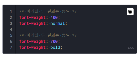
2.font-weight
- 폰트 굵기를 지정할 때 사용합니다.
- normal : 400
- bold : 700 (100 ~ 900)
- 글꼴의 두께로, 미리 정의된 단어나 100 ~ 900 사이의 숫자를 통해 설정합니다.
100: lighter
200
300
400: normal
500
600
700: bold
800
900: bolder
css 예제▼
|
@import url('https://fonts.googleapis.com/css?family=Nanum+Pen+Script&display=swap');
h1, p {
font-family: 'Nanum Pen Script', cursive;
}
h1 {
font-style: italic;
}
p {
font-weight: bold;
}
|
- 위 예제와 같이 하나씩 지정이 가능하지만 양이 많아지면 꽤 불편한 작업이 될 수 있습니다.
- font 프로퍼티를 쓰면 모든 과정을 한 번에 설정할 수 있습니다(.ex1 , .ex2 가 적용한 것!)
.box1 {
	font-size: 20px;
	font-family: 나눔고딕,NanumGothic,돋움,Dotum;
}
.box1 .title { font-weight: bold }
.ex1 { font: 15px NanumGothic, sans-serif }
.ex2 { font: italic bold 12px/30px Dotum, sans-serif }
사용법 적용▼
<html>
<head>
	<style>
		#text1 { font-size: 37px }
		#text2 { font-size: 28px }
		#text3 { font-size: 19px }

		.bold { font-weight: bold }
		.italic{ font-style: italic }
		.jinji{ font-family: "궁서" }

		#text4{ font: italic bold 20px serif; }
   </style>
</head>
<body>
	<div id="text1">37px</div>
	<div id="text2">28px</div>
	<div id="text3">19px</div>
	<br>
	<div class="bold">굵은 글씨</div>
	<div class="italic">기울인 글</div>
	<div class="jinji">진지한 글꼴</div>
	<br>
	<div id="text4">There's no books on my backpack</div>
</body>
</html>
 |
텍스트 정렬(align)

- 위 그림과 같이 이런 기능을 사용합니다.
예제▼
| html | css |
| <h1>텍스트 정렬</h1> <p id="right">오른쪽 정렬</p> <p id="middle">가운데 정렬</p> <p id="left">왼쪽 정렬</p> |
#right { text-align: right; } #middle { text-align: center; } #left { text-align: left; } |
실행화면▼
 |
양쪽 정렬 (justify)
- 공식 문서를 확인합니다.
https://www.w3schools.com/cssref/css3_pr_text-justify.asp
CSS text-justify property
W3Schools offers free online tutorials, references and exercises in all the major languages of the web. Covering popular subjects like HTML, CSS, JavaScript, Python, SQL, Java, and many, many more.
www.w3schools.com
inter-word : 단어 사이의 공백을 조정합니다.
line height
- 숫자 값으로 높이를 조정합니다.
- 공식문서도 확인을 합니다.
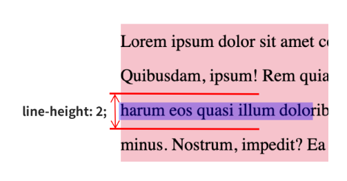
예제▼
| html | css |
| <div> line-height ❌ <p class=line-height_none>Lorem ipsum dolor sit amet consectetur adipisicing elit. Quibusdam, ipsum! Rem quia, facere veritatis, adipisci harum eos quasi illum doloribus quisquam alias nihil minus. Nostrum, impedit? Ea deleniti facilis porro.</p> </div> <div> line-height ✅ <p class="line-height_numb">Lorem ipsum dolor sit amet consectetur adipisicing elit. Quibusdam, ipsum! Rem quia, facere veritatis, adipisci harum eos quasi illum doloribus quisquam alias nihil minus. Nostrum, impedit? Ea deleniti facilis porro.</p> </div> |
.line-height_none { background: skyblue; } .line-height_numb { background: pink; line-height: 2; } |
실행화면▼
 |
https://developer.mozilla.org/en-US/docs/Web/CSS/line-height
line-height - CSS: Cascading Style Sheets | MDN
The line-height CSS property sets the height of a line box. It's commonly used to set the distance between lines of text. On block-level elements, it specifies the minimum height of line boxes within the element. On non-replaced inline elements, it specifi
developer.mozilla.org
글자 간격 (letter spacing)
예시▼
| html | css |
| <div> letter-spacing ❌ <p class=letter-spacing_none>Lorem ipsum dolor sit amet consectetur adipisicing elit. Quibusdam, ipsum! Rem quia, facere veritatis, adipisci harum eos quasi illum doloribus quisquam alias nihil minus. Nostrum, impedit? Ea deleniti facilis porro.</p> </div> <div> letter-spacing ✅ <p class="letter-spacing">Lorem ipsum dolor sit amet consectetur adipisicing elit. Quibusdam, ipsum! Rem quia, facere veritatis, adipisci harum eos quasi illum doloribus quisquam alias nihil minus. Nostrum, impedit? Ea deleniti facilis porro.</p> </div> |
.letter-spacing_none { background: skyblue; } .letter-spacing { background: pink; letter-spacing: 5px; } |
실행화면▼
 |
글자 들여 쓰기 (text indent)
- 들여 쓰기는 일반적으로 문장을 쓸 때 문자열을 오른쪽으로 당겨 주변의 문장과 구분하는 것을 말합니다.
예제▼
| html | css |
| <div> text-indent ❌ <p class=text-indent_none>Lorem ipsum dolor sit amet consectetur adipisicing elit. Quibusdam, ipsum! Rem quia, facere veritatis, adipisci harum eos quasi illum doloribus quisquam alias nihil minus. Nostrum, impedit? Ea deleniti facilis porro.</p> </div> <div> text-indent ✅ <p class="text-indent">Lorem ipsum dolor sit amet consectetur adipisicing elit. Quibusdam, ipsum! Rem quia, facere veritatis, adipisci harum eos quasi illum doloribus quisquam alias nihil minus. Nostrum, impedit? Ea deleniti facilis porro.</p> </div> |
.text-indent_none { background: skyblue; } .text-indent { background: pink; text-indent: 16px; } |
실행화면▼
 |
7. 위치정렬
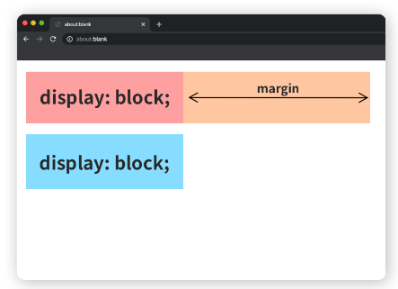
1. display요소가 보여지는 방식을 지정하는 프로퍼티에 대해 알아봅니다.
- block
- inline
block
- block은 덩어리 , 막다 라는 뜻을 가지고 있습니다.
- block을 가지고 있는 요소는 항상 새로운 줄에서 시작하며 따로 너비를 지정하지 않아도 width:100%가 기본입니다.
- 남은 길이는 margin으로 채워 옆으로 다른 요소가 오는 것을 막고 있습니다.
- div , hi1 ~ hi6 , p header , section 등이 해당합니다.
inline
- inline은 일렬로~ 라는 뜻을 가지고 있습니다.
- inline은 한정된 크기를 가지고 있으며 부모의 너비 안에서 한 줄에 들어갈 수 있는 만큼만 일렬로 배치됩니다.
- 새로운 줄에서 시작되지 않습니다.
- span , a , img 등이 이에 해당됩니다.
- width , height , margin-top , margin-bottom 프로퍼티가 적용되지 않습니다.

공식문서 (show_demo를 눌러서 확인합니다.)
https://www.w3schools.com/cssref/pr_class_display.asp
CSS display property
W3Schools offers free online tutorials, references and exercises in all the major languages of the web. Covering popular subjects like HTML, CSS, JavaScript, Python, SQL, Java, and many, many more.
www.w3schools.com
예제1▼
| html | css |
| <!-- display: block; 📦--> <h1>h1 태그</h1> <div>div 태그</div> <p>p 태그</p> <article>article 태그</article> <li>li 태그</li> <!-- display: inline; 📏 --> <strong>strong 태그</strong> <span>span 태그</span> <a href="/">a 태그</a> |
h1, div, p, article, li { background-color: pink; } strong, span, a { background-color: skyblue; } |
예제2▼
| html | css |
| <p class="box display_block">display: block;</p> <span class="box display_inline">display: inline;</span> <span class="box display_inline">display: inline;</span> <span class="box display_inline">display: inline;</span> <span class="box display_inline">display: inline;</span> <span class="box display_inline">display: inline;</span> |
.display_block { background-color: pink; margin: 0; width: 100px; } .display_inline { background-color: skyblue; } |
예제3▼
| html | css |
| <p class="display_block"> <a href="https://www.goorm.io/" class="display_inline">구름</a>은 <strong class="display_inline">“모두가 개발자가 된다.”</strong>라는 비전으로, 구름 서비스를 통해 모두가 개발자가 될 수 있는 <em class="display_inline">‘개발자 성장’</em> 중심의 생태계를 만들어나가고 있습니다. </p> |
.display_block { background-color: pink; } .display_inline { background-color: skyblue; } |
2. position 요소가 보여지는 방식을 지정하는 프로퍼티에 대해 알아봅니다.
- static
- relative
- absolute
- fixed
- z-index
static
- static은 고정된 이라는 뜻을 가지고 있습니다.
- position의 값은 static이 기본입니다.
- 죄표 프로퍼티 top , right , bottom , left를 사용할 수 없습니다.
relative
- relative는 상대적이라는 뜻을 가지고 있습니다.
- static과 외관상 차이는 안 나지만 좌표를 사용하면 차이를 느끼실 수 있습니다.
예시▼
| html | css |
| <div class="parent"> <div class="box static">position: static</div> <div class="box relative">position: relative</div> </div> |
.box { width: 100px; height: 50px; } .parent { border: 2px solid red; } .static { position: static; background: pink; left: 16px; top: 16px; } .relative { position: relative; background: skyblue; left: 16px; top: 16px; } |
실행화면▼
 |
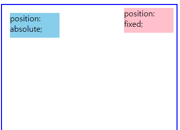
absolute
- 부모나 조상 중(relative , absolute , fixed)가 선언된 기준으로 좌표 프로퍼티가 작동합니다.
- static을 제외한 조상 요소를 가지지 않는다면, HTML 문서의 body 요소를 기준으로 위치를 설정하게 됩니다.
- 이 부분은 이해하는데 좀 어려운 부분이 있으니 공식문서를 보면서 이해를 해봅니다.
https://www.w3schools.com/cssref/playit.asp?filename=playcss_position&preval=absolute
Playit
www.w3schools.com
fixed
- 보이는 화면을 기준으로 좌표 프로퍼티를 이용하여 위치를 고정시킵니다.
- 스크롤할 때 따라다니는 메뉴를 본 적이 있을 건데 그 메뉴가 바로 fixed를 활용한 것입니다.
예제▼
| html | css |
| <div class="parent"> <div class="box fixed">position: fixed;</div> <div class="box absolute top">position: absolute;</div> <div class="box absolute bottom">position: absolute;</div> </div> |
.box { width: 100px; height: 50px; } .parent { height: 2400px; position: relative; border: 2px solid blue; } .absolute{ position: absolute; background-color: skyblue; } .top { top: 16px; left: 16px; } .bottom { bottom: 16px; right: 16px; } .fixed { position: fixed; right: 16px; top: 16px; background-color: pink; } |
실행화면▼
 |
- 실행을 해서 마우스 휠을 돌려보면 fixed가 따라오는 것을 확인할 수 있습니다.
z-index
- top , right , bottom , left 이외에 z-index도 있습니다.
- 수직으로 어떻게 쌓이는지 정합니다.
- 숫자가 클수록 전면에 출력됩니다.
- static을 제외한 요소에서만 적용됩니다.
예제▼
| html | css |
| <div class="parent"> <div class="box top">top</div> <div class="box middle">middle</div> <div class="box bottom">bottom</div> </div> |
.box { width: 100px; height: 50px; position: absolute; } .parent { position: relative; border: 2px solid red; width: 200px; height: 100px; } .top { background-color: pink; right: 16px; bottom: 16px; z-index: 50; } .middle { background-color: skyblue; right: 32px; bottom: 32px; z-index: 25; } .bottom { background-color: lemonchiffon; right: 48px; bottom: 48px; z-index: 1; } |
실행화면▼
 |
3. float 요소가 보여지는 방식을 지정하는 프로퍼티에 대해 알아봅니다.
예제1▼
| html | css |
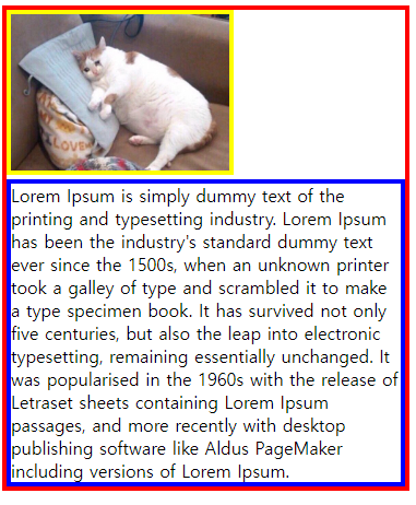
| <div class="container"> <img class="cat-img" src="https://thumb.sixshop.kr/uploadedFiles/11280/blogPost/image_1557380285585.jpg?width=1000"/> <p class="text">Lorem Ipsum is simply dummy text of the printing and typesetting industry. Lorem Ipsum has been the industry's standard dummy text ever since the 1500s, when an unknown printer took a galley of type and scrambled it to make a type specimen book. It has survived not only five centuries, but also the leap into electronic typesetting, remaining essentially unchanged. It was popularised in the 1960s with the release of Letraset sheets containing Lorem Ipsum passages, and more recently with desktop publishing software like Aldus PageMaker including versions of Lorem Ipsum.</p> </div> |
실행화면▼
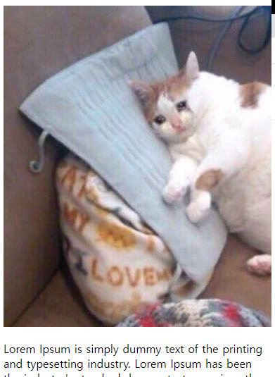 |
- 지금 화면에서는 글과 이미지가 위아래로 분리가 되어 있지만 이미지 옆에 바로 글자를 추가하여 신문처럼 화면을 바꾸어 주는 기능을 넣어 보겠습니다.
예제2▼ (이미지와 화면을 분리해 줍니다.)
| html | css |
| <div class="container"> <img class="cat-img" src="https://thumb.sixshop.kr/uploadedFiles/11280/blogPost/image_1557380285585.jpg?width=1000"/> <p class="text">Lorem Ipsum is simply dummy text of the printing and typesetting industry. Lorem Ipsum has been the industry's standard dummy text ever since the 1500s, when an unknown printer took a galley of type and scrambled it to make a type specimen book. It has survived not only five centuries, but also the leap into electronic typesetting, remaining essentially unchanged. It was popularised in the 1960s with the release of Letraset sheets containing Lorem Ipsum passages, and more recently with desktop publishing software like Aldus PageMaker including versions of Lorem Ipsum.</p> </div> |
.container { border: 4px solid red; } .text { margin: 0; border: 4px solid blue; } .cat-img { border: 4px solid yellow; width: 200px; } |
실행화면▼
 |
예제3▼ (.cat-img에 float를 추가합니다.)
| html | css |
| <div class="container"> <img class="cat-img" src="https://thumb.sixshop.kr/uploadedFiles/11280/blogPost/image_1557380285585.jpg?width=1000"/> <p class="text">Lorem Ipsum is simply dummy text of the printing and typesetting industry. Lorem Ipsum has been the industry's standard dummy text ever since the 1500s, when an unknown printer took a galley of type and scrambled it to make a type specimen book. It has survived not only five centuries, but also the leap into electronic typesetting, remaining essentially unchanged. It was popularised in the 1960s with the release of Letraset sheets containing Lorem Ipsum passages, and more recently with desktop publishing software like Aldus PageMaker including versions of Lorem Ipsum.</p> </div> |
.container { border: 4px solid red; } .text { margin: 0; border: 4px solid blue; } .cat-img { border: 4px solid yellow; width: 200px; float: left; } |
실행화면▼
 |
8. flexbox
- display , position의 한계를 극복하기 위해 생겼습니다.
- flexbox는 부모 요소인 flex container와 자식 요소인 flex item으로 구성되어 있습니다.
- flexbox를 사용하려면 부모 요소인 flex container에 display: flex;를 추가하면 됩니다.

1. flex container
- flex direction
- flex wrap
- flex flow
- justify content
- align - item
- align - content
flex direction
- flex direction의 뜻은 방향을 바꾼다 입니다.
- flex container 안에서 flex item이 배치될 기본 방향을 정할 수 있습니다.
- 따로 지정하지 않으면 row라는 기본값이 설정되며 왼쪽에서 오른쪽으로 정렬합니다.
| flex container | 값 | 방향 |
| flex direction |
row (기본) | 가로 |
| column | 세로 | |
| row -reverse | 반전 , 반대 | |
| column - reverse |
예제1▼
| html | css |
| <div class="container"> <div class="item box">1</div> <div class="item box">2</div> <div class="item box">3</div> <div class="item box">4</div> <div class="item box">5</div> <div class="item box">6</div> </div> |
.container { background-color: skyblue; padding: 16px; display: flex;/* flex container에 해당하는 부분에 display: flex를 작성 */ } |
예제2▼
| html | css |
| <div class="container"> <div class="item box">1</div> <div class="item box">2</div> <div class="item box">3</div> <div class="item box">4</div> <div class="item box">5</div> <div class="item box">6</div> </div> |
.container { background-color: skyblue; padding: 16px; display: flex; flex-direction: column; /* column은 세로방향, row는 가로방향 */ } |
예제3▼
| html | css |
| <div class="container"> <div class="item box">1</div> <div class="item box">2</div> <div class="item box">3</div> <div class="item box">4</div> <div class="item box">5</div> <div class="item box">6</div> </div> |
.container { background-color: skyblue; padding: 16px; display: flex; flex-direction: row-reverse; /* column-reverse 세로 역방향, row-reverse는 가로 역방향 */ } |
공식문서▼
https://developer.mozilla.org/ko/docs/Web/CSS/flex-direction
flex-direction - CSS: Cascading Style Sheets | MDN
flex-direction CSS 속성은 플렉스 컨테이너 내의 아이템을 배치할 때 사용할 주축 및 방향(정방향, 역방향)을 지정합니다.
developer.mozilla.org
flex wrap
- flex item을 한 줄에 담을 수 없을 때 사용합니다.
- flex wrap의 기본값은 nowrap입니다.
| flex direction | flex wrap |
| row | wrap |

| flex direction | flex wrap |
| column | wrap |

예제▼
| html | css |
| <div class="container"> <div class="item box">1</div> <div class="item box">2</div> <div class="item box">3</div> <div class="item box">4</div> <div class="item box">5</div> <div class="item box">6</div> </div> |
.container { background-color: skyblue; padding: 16px; display: flex; flex-direction: row; width: 20px; flex-wrap: wrap; /* flex-wrap의 기본값 */ } |
- column으로 바꿔서 실행을 합니다.
- height: 100px로 바꿔서 실행을 합니다.
실행화면▼
| row | column |
 |
 |
flex flow
- flex direction과 flex wrap을 한 번에 지정할 수 있습니다.
공식문서▼
https://developer.mozilla.org/ko/docs/Web/CSS/flex-flow
flex-flow - CSS: Cascading Style Sheets | MDN
flex-flow CSS 속성은 flex-direction, flex-wrap 속성의 단축 속성입니다.
developer.mozilla.org
justify content
- 문서의 가운데 정렬 방식과 같은 정렬 방식을 결정합니다.
- flex direction으로 정해진 방향에 flex item들을 어떻게 정렬할 건지 결정을 합니다.
| flex direction이 row일 경우 | 값 | 방향 |
| justify content | flex-start | 왼쪽 끝 |
| center | 가운데 | |
| flex-end | 오른쪽 끝 | |
 |
||
| flex direction이 column일 경우 | 값 | 방향 |
| justify content | flex-start | 위쪽 끝 |
| center | 가운데 | |
| flex-end | 아래쪽 끝 | |
 |
||
예제▼
| html | css |
| <h3>flex-direction: row (가로 방향)</h3> <div class="wrapper-row"> justify-content: flex-start <div class="container row start"> <div class="item box">1</div> <div class="item box">2</div> <div class="item box">3</div> </div> </div> <div class="wrapper-row"> justify-content: center <div class="container row center"> <div class="item box">1</div> <div class="item box">2</div> <div class="item box">3</div> </div> </div> <div class="wrapper-row"> justify-content: flex-end <div class="container row end"> <div class="item box">1</div> <div class="item box">2</div> <div class="item box">3</div> </div> </div> <h3>flex-direction: column (세로 방향)</h3> <div class="wrapper-column"> <div> <div>justify-content: flex-start</div> <div class="container column start"> <div class="item box">1</div> <div class="item box">2</div> <div class="item box">3</div> </div> </div> <div> <div>justify-content: center</div> <div class="container column center"> <div class="item box">1</div> <div class="item box">2</div> <div class="item box">3</div> </div> </div> <div> <div>justify-content: flex-end</div> <div class="container column end"> <div class="item box">1</div> <div class="item box">2</div> <div class="item box">3</div> </div> </div> </div> |
.box { width: 48px; height: 48px; background-color: #fff; border: 4px solid pink; text-align: center; box-sizing: border-box; padding: 8px; } .wrapper-row { display: flex; margin-bottom: 10px; } .wrapper-column { display: flex; justify-content: space-between; } .container { display: flex; } .row { background-color: skyblue; flex-direction: row; width: 300px; } .column { background-color: lemonchiffon; margin-right: 24px; flex-direction: column; width: 50px; height: 400px; } .start { justify-content: flex-start; } .center { justify-content: center; } .end { justify-content: flex-end; } |
간격
| flex direction | 값 | 내용 |
| justify content |
space - between | 시작과 끝에 아이템을 하나씩 두고 나머지를 배치 |
| space - around | 시작과 끝에 아이템을 하나씩 두고 동일한 간격으로 배치 | |
 |
||
예제▼ (글 보다 실행을 해보면 이해가 더 빠릅니다.)
| html | css |
| <h3>flex-direction: row (가로 방향)</h3> <div class="wrapper-row"> justify-content: flex-start <div class="container row start"> <div class="item box">1</div> <div class="item box">2</div> <div class="item box">3</div> </div> </div> <div class="wrapper-row"> justify-content: center <div class="container row center"> <div class="item box">1</div> <div class="item box">2</div> <div class="item box">3</div> </div> </div> <div class="wrapper-row"> justify-content: flex-end <div class="container row end"> <div class="item box">1</div> <div class="item box">2</div> <div class="item box">3</div> </div> </div> <div class="wrapper-row"> justify-content: space-between <div class="container row between"> <div class="item box">1</div> <div class="item box">2</div> <div class="item box">3</div> </div> </div> <div class="wrapper-row"> justify-content: space-around <div class="container row around"> <div class="item box">1</div> <div class="item box">2</div> <div class="item box">3</div> </div> </div> <h3>flex-direction: column (세로 방향)</h3> <div class="wrapper-column"> <div> <div>justify-content: flex-start</div> <div class="container column start"> <div class="item box">1</div> <div class="item box">2</div> <div class="item box">3</div> </div> </div> <div> <div>justify-content: center</div> <div class="container column center"> <div class="item box">1</div> <div class="item box">2</div> <div class="item box">3</div> </div> </div> <div> <div>justify-content: flex-end</div> <div class="container column end"> <div class="item box">1</div> <div class="item box">2</div> <div class="item box">3</div> </div> </div> <div> <div>justify-content: space-between</div> <div class="container column between"> <div class="item box">1</div> <div class="item box">2</div> <div class="item box">3</div> </div> </div> <div> <div>justify-content: space-around</div> <div class="container column around"> <div class="item box">1</div> <div class="item box">2</div> <div class="item box">3</div> </div> </div> </div> |
.box { width: 48px; height: 48px; background-color: #fff; border: 4px solid pink; text-align: center; box-sizing: border-box; padding: 8px; } .wrapper-row { display: flex; margin-bottom: 10px; } .wrapper-column { display: flex; justify-content: space-between; } .container { display: flex; } .row { background-color: skyblue; flex-direction: row; width: 300px; } .column { background-color: lemonchiffon; margin-right: 24px; flex-direction: column; width: 50px; height: 400px; } .start { justify-content: flex-start; } .center { justify-content: center; } .end { justify-content: flex-end; } .between { justify-content: space-between } .around { justify-content: space-around; } |
align - item
- 컨텐츠의 크기만큼 조정을 해줍니다.
예제▼(글 보다 실행을 해보면 이해가 더 빠릅니다.)
| html | css |
| <h3>flex-direction: row (가로 방향)</h3> <div class="wrapper-row"> align-items: flex-start <div class="container row start"> <div class="item box">1</div> <div class="item box">2</div> <div class="item box">3</div> </div> align-items: center <div class="container row center"> <div class="item box">1</div> <div class="item box">2</div> <div class="item box">3</div> </div> align-items: flex-end <div class="container row end"> <div class="item box">1</div> <div class="item box">2</div> <div class="item box">3</div> </div> </div> <h3>flex-direction: column (세로 방향)</h3> <div class="wrapper-column"> <div> <div>align-items: flex-start</div> <div class="container column start"> <div class="item box">1</div> <div class="item box">2</div> <div class="item box">3</div> </div> </div> <div> <div>align-items: center</div> <div class="container column center"> <div class="item box">1</div> <div class="item box">2</div> <div class="item box">3</div> </div> </div> <div> <div>align-items: flex-end</div> <div class="container column end"> <div class="item box">1</div> <div class="item box">2</div> <div class="item box">3</div> </div> </div> </div> |
.box { width: 96px; height: 48px; background-color: #fff; border: 4px solid pink; text-align: center; box-sizing: border-box; padding: 8px; } /* nth-child(n)으로 첫번째와 세번째에 해당하는 .item의 크기를 바꿔줍니다.*/ .wrapper-row .box:nth-child(1) { height: 88px; } .wrapper-row .box:nth-child(3) { height: 120px; } .wrapper-column .box:nth-child(1) { width: 120px; } .wrapper-column .box:nth-child(3) { width: 160px; } .wrapper-row { display: flex; flex-direction: column; } .wrapper-column { display: flex; } .container { display: flex; } .row { background-color: skyblue; flex-direction: row; width: 400px; height: 200px; } .column { background-color: lemonchiffon; margin-right: 24px; flex-direction: column; width: 200px; height: 400px; } .start { align-items: flex-start; } .center { align-items: center; } .end { align-items: flex-end; } |
공식문서▼
https://developer.mozilla.org/en-US/docs/Web/CSS/align-items
align-items - CSS: Cascading Style Sheets | MDN
The CSS align-items property sets the align-self value on all direct children as a group. In Flexbox, it controls the alignment of items on the Cross Axis. In Grid Layout, it controls the alignment of items on the Block Axis within their grid area.
developer.mozilla.org
align - content
- flex item들이 여러줄일 경우 flex - direction 방향을 기준으로 수직정렬 방법을 결정합니다.
- align - content를 쓰기 위해선 flex-wrap : wrep가 꼭 포함됩니다.
- wrep가 없다면 적용이 되지않습니다.
- 여러줄에 걸친 경우 item들이 한 몸처럼 움직입니다.

예제▼(글 보다 실행을 해보면 이해가 더 빠릅니다.)
| html | css |
| <h3>flex-direction: row (가로 방향)</h3> align-content: flex-start <div class="container row start"> <div class="item box">1</div> <div class="item box">2</div> <div class="item box">3</div> <div class="item box">4</div> <div class="item box">5</div> <div class="item box">6</div> </div> align-content: center <div class="container row center"> <div class="item box">1</div> <div class="item box">2</div> <div class="item box">3</div> <div class="item box">4</div> <div class="item box">5</div> <div class="item box">6</div> </div> align-content: flex-end <div class="container row end"> <div class="item box">1</div> <div class="item box">2</div> <div class="item box">3</div> <div class="item box">4</div> <div class="item box">5</div> <div class="item box">6</div> </div> align-content: space-between <div class="container row between"> <div class="item box">1</div> <div class="item box">2</div> <div class="item box">3</div> <div class="item box">4</div> <div class="item box">5</div> <div class="item box">6</div> </div> align-content: space-around <div class="container row around"> <div class="item box">1</div> <div class="item box">2</div> <div class="item box">3</div> <div class="item box">4</div> <div class="item box">5</div> <div class="item box">6</div> </div> <h3>flex-direction: column (세로 방향)</h3> align-content: flex-start <div class="container column start"> <div class="item box">1</div> <div class="item box">2</div> <div class="item box">3</div> <div class="item box">4</div> <div class="item box">5</div> <div class="item box">6</div> </div> align-content: center <div class="container column center"> <div class="item box">1</div> <div class="item box">2</div> <div class="item box">3</div> <div class="item box">4</div> <div class="item box">5</div> <div class="item box">6</div> </div> align-content: flex-end <div class="container column end"> <div class="item box">1</div> <div class="item box">2</div> <div class="item box">3</div> <div class="item box">4</div> <div class="item box">5</div> <div class="item box">6</div> </div> align-content: space-between <div class="container column between"> <div class="item box">1</div> <div class="item box">2</div> <div class="item box">3</div> <div class="item box">4</div> <div class="item box">5</div> <div class="item box">6</div> </div> align-content: space-around <div class="container column around"> <div class="item box">1</div> <div class="item box">2</div> <div class="item box">3</div> <div class="item box">4</div> <div class="item box">5</div> <div class="item box">6</div> </div> |
.box { width: 96px; height: 48px; background-color: #fff; border: 4px solid pink; text-align: center; box-sizing: border-box; padding: 8px; } .container { display: flex; width: 400px; height: 200px; flex-wrap: wrap; } .row { background-color: skyblue; flex-direction: row; } .column { background-color: lemonchiffon; flex-direction: column; } .start { align-content: flex-start; } .center { align-content: center; } .end { align-content: flex-end; } .between { align-content: space-between } .around { align-content: space-around } |
- align - content 부분을 align - item으로 바꿔서 실행을 해보면 차이를 보실 수 있습니다.
2. flex item
- flex - grow
- flex - shrink
- flex - basis
- flex
flex - grow
- 값이 1 이상일 경우 flex item의 원래 크기와 상관 없이 flex container를 채우기 위해 커집니다.

예제▼
| html | css |
| <div class="container"> <div class="item">1</div> <div class="item none">0</div> </div> <div class="container"> <div class="item">1</div> <div class="item">1</div> <div class="item">1</div> </div> <div class="container"> <div class="item">1</div> <div class="item target">2</div> <div class="item">1</div> </div> |
.container { background-color: skyblue; height: 36px; padding: 12px; margin-bottom: 16px; display: flex; } .item { display: flex; justify-content: center; align-items: center; border: 1px solid #fff; background: pink; flex-grow: 1; } .target { background-color: lemonchiffon; flex-grow: 2; } .none { background-color: grey; flex-grow: 0; } |
flex - shrink
- 축소와 관련 있습니다.
- shrink는 줄어들다의 뜻을 가지고 있습니다.
- 기본값은 flex - grow와 달리 1을 가지고 있습니다.
- 0일 경우 줄어들지 않고 원래 크기를 유지합니다.

예제▼
| html | css |
| <div class="container none"> <div class="item">0</div> <div class="item">0</div> <div class="item">0</div> </div> <div class="container active"> <div class="item">1</div> <div class="item">1</div> <div class="item">1</div> </div> <div class="container target"> <div class="item">1</div> <div class="item">3</div> <div class="item">5</div> </div> |
.container { background-color: skyblue; height: 36px; padding: 12px; margin-bottom: 16px; display: flex; width: 400px; } .item { /* 텍스트 가운데 정렬을 위한 스타일*/ width: 200px; display: flex; justify-content: center; align-items: center; border: 1px solid #fff; background: pink; } .none > .item { flex-shrink: 0; } .active > .item { flex-shrink: 1; } .target > .item:first-child { flex-shrink: 1; } .target > .item:nth-child(2) { flex-shrink: 5; } .target > .item:last-child { flex-shrink: 3; } |
공식문서▼
https://developer.mozilla.org/ko/docs/Web/CSS/flex-shrink
flex-shrink - CSS: Cascading Style Sheets | MDN
flex-shrink CSS property는 flex-item 요소의 flex-shrink 값을 설정하는 속성입니다. 만약 flex-item 요소의 크기가 flex-container 요소의 크기보다 클 때 flex-shrink 속성을 사용하는데, 설정된 숫자값에 따라 flex-co
developer.mozilla.org
flex - basis
- item의 기본 크기를 결정합니다.
- 기본값은 auto 입니다.
- flex - grow에 따라 비율을 나누어 갖습니다.
- 복잡하게 생각하지 말고 공식문서를 확인 합니다.
공식문서▼
https://developer.mozilla.org/ko/docs/Web/CSS/flex-basis
flex-basis - CSS: Cascading Style Sheets | MDN
flex-basis CSS 속성은 플렉스 아이템의 초기 크기를 지정합니다. box-sizing을 따로 지정하지 않는다면 콘텐츠 박스의 크기를 변경합니다.
developer.mozilla.org
flex
- flex - grow , flex - shrink , flex - basis를 한번에 설정할 수 있습니다.
- 위 순서대로 값을 넣어야 합니다.

